Comic back cover ad #3
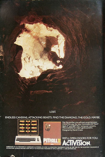 It took some time for me to realise that this was not the image of a gigantic rectal passage. It then took some time for me to realise that despite that, I was still staring up someone’s arse.I never played Pitfall II. I don’t know what to say about it. The computer looks supremely chunky. It practically sports love handles. And the game looks very orange. That is all.
Comic back cover ad #2
Are you man enough for Megaforce?
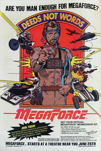
Chuck Norris is. Look at him. There he stands, wearing only a belt and a calculator, not a gonad in sight. Erupting from behind him, a motorcycle with dinnerplate wheels, a decepticon DeLorean blasting whipped cheese from its windshield, a squadron of dune buggies and the entire US Air Force from the Vietnam war. Save up your dollar, you too could be the proud owner of a Megaforce patch, membership card and bike decal. You can proudly display your lack of genitalia, resting assured no one will question your nudity or calculator-laden chest because you’re a card-carrying, patch-weilding member of Megaforce. If anyone questions you, just point at your glistening bike decal and laugh in their faces. Don’t have a bike? Stick it on your DeLorean.
Bill Bryson: What the hell?
I’ve just finished reading Bill Bryson’s “Mother Tongue”, a reasonably amusing edutainment book exploring the history, complexity and potential future of the English language. All in all, it’s a suitably entertaining read, but I find it’s somewhat flawed by the small issue that factually, it’s probably wildly innacurate. I base this assumption on the various passages devoted to the Australian dialect of the English language, most of which are fundamentally, well, wrong. While I’d like nothing less than to simply reproduce these passages verbatim for your own edification, I have a moral aversion to plagiarism, and shall instead address the various “examples” of Australian speech/grammar/spelling, and then we’ll discuss whether or not anyone ever actually uses them.
Another temptation I shall avoid is the urge to address Mr. Bryson’s quoting from “Lets Talk Strine”, a comedic parody of a book written in 1965 by this bloke, and not representing anything realistic whatsoever about the way anyone did, does, or likely ever will speak.
Anyhow, the actual examples that annoy me:
“Tucker”. This word means “food”. It’s commonly used as part of the term “bush tucker”, and by Australia’s version of rednecks. It’s very quickly disappearing from the language. (And good riddance, say I.)
“Slygrogging.” I have never ever heard this word spoken, nor have I read it prior to seeing it in this book. Apparently (and somewhat evidently, I admit), it defines the act of sneaking out to have a drink. Where I come from, we call that “sneaking out to have a drink”.
“Nong.” A nong is an idiot. No one has used this word since 1987.
“Don’t come the raw prawn with me.” Oh, god. How I both love and loathe this phrase. This alleged common element of Australian parlance, along with various others (”technicolour yawn” for vomit, as cited in this very book is another) survive thrivingly on tea towels and in useless Australian language phrase books. No one ever says them.
Furthermore, the next paragraph in the book proposes a few additional facts that are entirely debatable:
“In Australia, people eat cookies, not biscuits.” No, we don’t. We eat biscuits. Americans eat cookies. If you want to be thoroughly pedantic, we eat cookies when we buy them from Subway.
“They spell many words the American way - labor rather than labour, for instance.” To hell we do. If I’d have spelled the word “labor” in school, I’d have been sorely reprimanded for it, and rightly so. The Australian Labor Party is a vestige of some idiot’s idea of modernising the image of the political party (well, as modernised as it could get in 1912), and is the only time we spell the word without the “u”. As a rule, we follow British spelling conventions, not American conventions. No “-ize” endings, no “-or” endings. And no nukular.
It’s inconsistencies like these that make me doubt the other “facts” presented in the book, particularly when I’m unable to verify them myself and am forced to take them at face value.
I also dislike the easy-to-digest approach when it’s used to present incorrect information, because, frankly, people are more likely to remember rubbish when it’s presented in an amusing format.
I’ve had my whinge. You can all go home now.
Time, Under Fire, apparently
I have a weak spot for two-dollar DVDs. The more ambitious the plotline, and the more the cover looks like it's been designed in Paint Shop Pro, the more likely I'll buy it, and the more likely I'll enjoy it for all the wrong reasons. To wit:
“Time Under Fire”
Starring: Jeff Fahey, Richard Tyson, and absolutely no one else of any significance.
Plot: A nuclear submarine cruising around the Bermuda Triangle is inexplicably drawn into a luminescent undersea vagina --
-- that throws it into the future. In this bizarre alternate timeline, the captain of the submarine encounters himself as a militant rebel leader, and must fight his way through a thoroughly confusing series of events involving another, bigger, and spectacularly unexplained submarine, Richard Tyson with no neck performing the worst Jimmy Stewart impression since Jimmy Stewart, and Emperor Palpatine if he was from Alabama.
Worth watching for: Some of the worst split-screening actor duplication ever, and easily the most horrific sex scene since Titanic.
Also, random goo-oozing robots.
Overall: It’s extremely awful, but that was to be expected. It appears to have been filmed on a budget of about sixty cents and a licorice strap, and the plot is so thoroughly confusing even the most basic elements of it fail to make any sense. The special effects are decent. However, it would have been an adequate movie if more time had been spent ironing out the spectacularly convoluted storyline, rather than spent trying to find a way to crow-bar in some exploding cloned robots with green paint on.
Also, if anyone can explain to me how the evil submarine can at one moment be randomly hovering in a vacuous black space inside a warehouse, and the next moment be submerged at the deepest depths of the ocean, you’ve won yourself a gold star.
Comic back cover ad #1
So, there we were, walking to the railway station. In the rain. And kind of in a hurry. Almost at the corner, there’re two green environmentally friendly shopping bags, their contents covered in cling wrap with a small sign with my favourite word on it: “Free.” After spending a day in the city, we return to explore the freebies. Under the layer of moist cling wrap lay two foot-high piles of comic books, ranging from this year’s latest obscurities to some Teen Titans comics from the early ’80s. Also, some “mature aged readers” arthouse comics (read: badly inked porn) and the instruction manual for an iPod.
Atari Lynx. It consumes food, apparently. I remember the Lynx.I remember it being gigantic, yet, at the time, beautifully designed and executed. The screen, capable of displaying approximately four crudely coloured pixels (and capable of draining approximately six AA batteries in the time it takes to turn the power on) was amazingly crisp compared to the Sega Game Gear, and the ability to rotate the device to play games vertically was awesome. Even though there were virtually no games made that exploited this gymnastic skill.This advertisement was on the back of a comic from the early ’90s. The alarming brown stains on it are probably just water marks, but I chose not to delve further into their origins. Atari made a brave choice in comparing the Lynx to the Game Boy in the advertisement, considering the original Game Boy (as displayed) was little smaller than a housebrick. Here, the Lynx galumphs over the Nintendo handheld, threatening to crush it like so many a teenage knee. In the centre, Steve Irwin attempts to outrun the Game Boy by surfing headlong into a game of mastermind. I vaguely want a Lynx, now. I’d buy one on eBay, but the postage charge for something the size of an arcade table would be phenomenal. I miss the ’90s.
Jean-Claude Van Damme is dead in Star Trek.
This is awesome. I was just reading up on the Crossovers & Spin-Offs Master Page, which I’ll happily credit for everything I’m about to say. The CO&SOMP is a database of almost every case of two television series meeting that have ever occurred. There’s a whole bunch of nifty stuff on there, but I’m particularly fond of Group 10, the “Jean-Claude Van Damme is dead” group. The group consists of the following TV shows: Bewitched, Crossing Jordan, Enterprise, Heroes, Knight Rider, Las Vegas, Medium, The Office, Passions, Star Trek, Star Trek: DS9, Star Trek: TNG, Star Trek: Voyager, Tabitha and Team Knight Rider
Thanks to an episode of Las Vegas in which Jean-Claude Van Damme made a guest appearance as himself, and was killed off as himself, he is now dead in that entire universe. This means that on Las Vegas, Passions, Crossing Jordan and Heroes, there can be no new Jean-Claude Van Damme movies, because he’s dead.
It’s bizarre and I love it.
Crossovers & Spin-Offs Master Page: http://poobala.com/crossoverlistb.html
Sydney's "Tangara" train in Lego, kind of
Here's an attempt at designing Sydney's "Tangara" train as a Lego model, using some wing-ding Lego modelling software for the Mac. The colours are based on the current (2008) trend for all of the trains to be represented in yellow.
In hindsight, I could probably have made it eight studs wide, rather than six, to give a bit more detail. I tried to stick with Lego's standard of six studs for a train, though.
Batman wasn't always cool.
For a start, he was once a man in grey pyjamas. And as scary as that is, this is scarier:
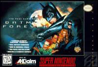
Now, before you assume I'm dashing copyright and ploughing my way through every title on the Super Nintendo on an emulator, I have a sad confession to make.
I own this game.
You'd think that was bad enough, but it gets worse. I own this game because I was sent a free copy from the Nintendo Magazine System some time in the early '90s. I was sent the free copy because, if I remember correctly, I drew an unoriginal sketch of Cammy from Super Street Fighter 2 in her underwear. Y'see, I'd worked out that the magazine distinctly favoured drawings of naked chicks. Even if they were just traced from the box-art and given ineffectual breasts. I have the magazine clipping somewhere.
Anyhow. Nintendo Magazine System -> Badly drawn naked Cammy -> Free Batman Forever game.
I assume they had a warehouse of shit games they'd dole out to kids who sent them drawings. I assume by the time they got to mine they'd run out of Cool Spot.
Fundamentally, there's nothing wrong with Batman Forever. It's playable, it's somewhat fun, it looks cool. It's flawed, though, because it's a) fairly shit, and b) cashing in on the Batman Forever license and disappointing a crudload of people. Well, the ones that paid for it, anyway.
Before I chew through Batman Forever's problems, let's summarise the good points.
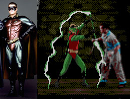
The graphics are splendid. Much like Mortal Kombat, the characters are entirely digitised. They hired a bunch of actors (clearly not Val Kilmer and co) and stood them at blue-screens while they kicked and punched and bat-a-ranged their way through the characters various moves. Batman looks great. Robin, however, suffered a bizarre retrofitting of his costume:
On the left, Chris O'Donnell in costume as Robin from the film, resplendant in a metallic nipplesuit. On the right, the Boy Wonder makes a re-appearance in red and green tights and a bright green masquerade mask. I guess there was some concern about the similarity between the Batman and Robin sprites if they were both dark and brooding. Or someone really wanted a game character in a leotard.
The fighting style isn't entirely bad. It plays slightly better than the first Mortal Kombat game, but I admit that's not saying much.
The music is rather nice. It's eerie and appropriate.
The, um, backgrounds are nice.
Okay, I'm grasping at straws. The graphics are great. There the awesomeness ends. Allow me to introduce you to the title screen of Batman Forever:
Oh, wait. That's not the title screen. But it might as well be. You get to see it more than you get to see the levels, title screen and end credits combined.
Someone in the Batman Forever programming office had an epiphane (or an aneurism) when it comes to gaming styles, and decided to mix the fighting genre with the platform genre. It's not a bad idea on paper (kind of like communism), but in reality it plays out like a wet sock.
The first problem is the levels are too short. They're essentially no bigger than the fighting arenas in Mortal Kombat or Street Fighter. Each stage has perhaps four or six foes in it, who appear out of doorways or pipes. You kill them, the door at the right of the stage opens, you move on to the next one. (After a bit of "Hold On".) And there are dozens and dozens of stages. Done properly, this would have worked well. For example, Dragon: The Bruce Lee Story handles the same style of play properly. Instead of the game being primarily a platformer, each level in Dragon is primarily a fighting genre brawl. The brawls last for considerable time, and the game moves on afterwards with nary a pause. The other side of the coin is something like River City Ransom for the NES, where each level is played out as several dozen enemies are battled and defeated, then the scenery changes.
It's far, far, far from a good idea to set the game up so each level involves only defeating a small number of very easy foes before moving on to the next level. After a pause. That's longer than the level was.
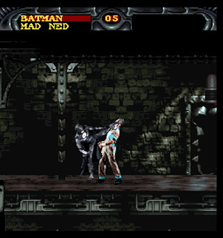
Here, Batman delivers a crotch-distending roundhouse kick to "Mad Ned", a pyjama-wearing inmate of Arkham Asylum. It's best to admire Batman Forever in screenshots. It really looks quite nice. It's a shame it plays so very, very badly.
Why Colin and Justin slightly annoy me.
Colin McAllister and Justin Ryan. They’re Scottish, they’re gay, and they do a spectacular job of decorating people’s homes. Usually, ostensibly, without their permission. But they annoy me, slightly. Together, they’ve made numerous TV shows about bad design ideas, how to decorate your home so people will buy it, and so on. Today, I’m focusing on two of their shows. One is a British series called “How Not To Decorate”, the second is a newer Canadian series called “Home Heist”.
The former of these series’ consisted of Colin and Justin appearing at someone’s poorly designed, badly executed and generally ugly home, and proceeding to renovate the Christ out of it until it resembled something awesome. This does not annoy me in any way.
The latter series is much of the same, with the part about the house being badly designed and ugly being substituted for the house being basically an average house, much like the one you’re sitting in now. This annoys me.
It annoys me because of the format of the show. The “plot”, as it were, of each episode is as follows.
Colin and Justin “break in” to the victim’s home. They mock everything within. Stealing a couple of artifacts, usually an ugly arm chair and a component of the poor person’s collection of dolls or beer bottles or something, they ambush the person at some point in their day-to-day activities. Usurping their house keys, Colin and Justin now begin re-inventing the home.
Along the way, they force the home owners to wear t-shirts with demeaning phrases on them, which I acknowledge is all in good fun. They also “teach” the home owners three lessons regarding parts of home decoration that they’ve decided the home owners suck at. Which, in many cases, is fair enough.
I’m also happy to acknowledge that the end result of all of this is that the home owners get a brand new, professionally designed interior over four rooms for nothing. I’m not oblivious to this.
The part that really jostles my coconuts is the way Mr. McAllister and Mr. Ryan mock people’s homes. I grant that in some cases, bad design prevails. In the vast majority of cases, though, it’s very clear that a lack of money has prevailed. For example, the family who’s baby daughter’s bedroom was also the laundry, complete with dryer. Same for the family who’s child’s room contained a fully fitted kitchen, minus stove. It’s not a case of someone deciding this would be a fantastic design move, it’s more a case of the home owners could not afford an alternative solution. It gets my goat when people are insulted for things that clearly aren’t their own choices or their own fault.
As I said before, I didn’t have a problem with the first show. It was British, the humour was more prevalent, and nine times out of ten, the homes actually were total home design disasters. For example, the house that had one room with alternating pink and black walls covered with fluourescent hand-prints. Yes, please, mock that. Don’t mock someone’s choice not to re-paint their home from the original beige, nor someone’s decision to keep hand-me-down furniture, nor someone’s decision not to store their crap away.
Oh, yeah. People’s crap. I take umbrage at this part, too.
Sure, yes, design-wise, having your belongings in your house is a horrible idea. It makes everything look messy. However, we don’t all live in IKEA catalogues, and it just so happens that we all own shit. And most of us want to see it. Not two items of it. Not just the items that match colours. I don’t consider it materialistic to want to own things that remind you of your life, and I don’t consider it bad design to want to display them, in any number.
I actually wonder how the people who own the homes Colin and Justin renovate manage once C and J have left and they’re left with the dilemma of re-assimilating their own belongings back into the (admittedly very nice) design they’ve been presented with.
The British version had a follow-up segment at the end of each episode showing how the home owners had adapted the final design to work for them. Canadian one doesn’t.
Anyway. I’ve ranted about two gay guys renovating houses for far longer than I really wanted to. I like the show, but it irritates me for the above reasons.
Hoorah.
How not to review video games.
I’ve been reading a lot of reviews for Super Nintendo games, recently. Mostly because I have an annoying desire to force myself to like playing RPGs, and it’s not working very well. I hate leveling characters up. I hate fighting in role-playing games. I want to beat you up, not do math. Anyway. Having read many reviews, I’ve come up with some pointers for anyone who plans to write their own and doesn’t want to come off sounding like a mentally retarded eleven-year-old.
1. Don’t pad your review out with twelve paragraphs about the game’s story. If you can’t summarise the plot of a video game in one paragraph, that’s a strike against the game, and you shouldn’t be dwelling on it. Or even worse, you shouldn’t be counting on it to increase your word count.
2. Don’t list things. It’s great that the game has thirty different weapons in it, but please don’t tell me about all of them individually.
3. Do not use any of the following phrases:
“Why are you still reading this review and not buying/playing the game?” “Buy it! Buy it! Buy it!” “BEST GAME EVAR” 4. Learn to spell.
5. Please actually play the game you’re reviewing before you review it. If I had a dollar for every review I’ve read that focused on the first two levels of a game and nothing past that, I’d be wealthy. If you can’t play it past level two, tell us why. Don’t try to make up a review about parts of the game you haven’t seen.
6. Same thing goes for your screenshots. Don’t just include the title screen and the first level. Show us you played the game. Comment on the screenshots. Sell what you’re trying to tell us.
If you can take those six pieces of advice, maybe the internet will become a less embarassing place.
Also, upgraded to Wordpress 2.5. It seems pretty.
Book, movie, video game: Congo
I’m a fan of Michael Crichton. I like his books. I also somewhat enjoy the movies that are based on his books. His books make good movie material. Generally speaking. Congo is the exception to this rule. Congo was a decent book, but it’s far from a good movie.

The basic storyline, for those unfamilar, is as follows. A telecommunications company, wanting to get an edge on its rivals, seeks the mystical blue diamonds of the mines of King Solomon, which have been located in the lost city of Zinj, in the Congo, Africa. In order to properly locate the city, they enlist the aid of a gorilla, Amy, who has been taught American Sign Language by her keeper, Peter. Amy was born near the city of Zinj, and has had dreams and drawn pictures of symbology from the area. And that’s about it.
Here are a few of the subtle changes made between Congo, the book, and Congo, the movie.
IN THE BOOK:
A telecommunications company wants blue diamonds because of their superconductive properties, so they can build better silicon chips and destroy their competitors.
IN THE MOVIE:
A telecommunications company wants blue diamonds so they can BUILD LASERS THAT WILL CUT APES IN HALF.
IN THE BOOK:
Karen Ross is a career-driven psychopathic super-bitch who wants to find the diamonds because her career depends on it, goshdurnit. She’s also blonde, tall, and in her early ’20s.
IN THE MOVIE:
Karen Ross is a spectacularly benign individual who wants to locate her ex-boyfriend (played by Bruce Campbell, no less), who was on an earlier expedition to the jungle. She’s still blonde, but she’s now in her ’30s and is played by Laura Linney, who’s only claim to fame to date has been Melrose Place.
IN THE BOOK:
Amy, the gorilla, speaks American Sign Language, and is entirely believeable.
IN THE MOVIE:
Amy, the gorilla, speaks American Sign Language, which is translated by a Nintendo Power Glove into the gorilla equivalent of Stephen Hawking. Except retarded. Very, very retarded. Somehow, in the translation from novel to film, Amy also became entirely made out of rubber and acquired a neck that would make Godzilla jealous. I’d like to include a picture of this, but Google Image Search turned up squat. Sorry.
IN THE BOOK:
???
IN THE MOVIE:
For no apparent reason, Tim Curry exists. As a Romanian philanthropist with an utterly ridiculous accent. His character literally serves no purpose. There is no reason for him to be there, whatsoever. Ostensibly, his character is there to fund the expedition to the congo. However, once they reach the airport, he explains in his stupidly stupid accent that he cannot afford the fuel for the plane, so Laura Linney pays for it, instead. Curry then tags along, occasionally providing a snippet of exposition that could have just as easily been spoken by one of the African porters. Or a tree.
IN THE BOOK:
A great deal of narrative is reserved for the investigation of the city of Zinj, and for the discovery and explanation of the mystery behind the grey gorillas.
IN THE MOVIE: “Holy bejeezus, grey gorillas!”
“Look, convenient heiroglyphics, they must be the guardians of the diamond mine!”
“Look they’re eating Tim Curry!”
“YAAAAY!”
“Now let’s dice them with the laser.”
So there. Congo, the movie, sucks. It’s enjoyable, if you like turning your brain off, though.
BUT WAIT, THERE’S MORE.
I found “Congo: The Movie - The Secret Of Zinj” for Super Nintendo. It’s….far from the best piece of video game programming I’ve yet to encouter.
Here’s the title screen, resplendant with rubber ape. So far, it’s not too scary.
A nice touch: Interactive cut-scenes. In both film and novel, there’s a part where the first expedition’s campsite is remotely surveyed by a rotating video camera on a tripod. As the team back in the US watch the footage and rotate the camera around, they see grey gorillas and a whole bunch of dead bodies. In this lil interactive cut scene, the camera rotates randomly and wildly and you can shoot at the gorillas. Evidently if you don’t shoot them, nothing significant happens. Boo.
And this is the point at which I stopped playing, because it became totally and unbearably shit. You play the part of Munro Kelly, the “great white hunter”. Apparently the rest of the Congo cast couldn’t make it, perhaps they all went to Devonshire Tea in Mombasa. Alone in his inflatable dinghy, you must steer Munro through the rapids of the Congo river, collecting floating diamonds.
Various obstacles block your way, most of them kill you. Sticks and sharp rocks puncture your dinghy causing you to lose one of your three lives. Ramps are required to jump over some obstacles and require ridiculously precise aim and impossibly correct speed. The river currents are seemingly random, and often pull you backwards at the time you should be moving forwards, sending Munro to his seething death atop a rock pinnacle.
As if it’s not bad enough already, half-way through this horrible level the water turns piss yellow and the sticks and obstacles become virtually invisible because they’re the SAME COLOUR. The game also speeds up to a blistering speed and your avoidance of obstacles becomes more of an exercise in repeating the level over and over, memorising the directions to press.
It’s worth noting that the graphics here are quite nice. Munro’s boat is pre-rendered CG and has loads of animation frames in its rotation. The water surface is a texture that’s warped around using Mode-7 and is quite effective when the level is moving slowly. Once it speeds up, though, it becomes epileptically nauseating and suffers from an irritating strobe effect once the speed of horizontal movement catches up with the speed of pattern repeat, kind of like the illusion of car rims spinning backward under strobing street lights.
I gave up after this level, the flaws in the game are too unbearable to continue. Looks good, sounds average, plays like a meatloaf.
Exotic beverage review: Battery Energy Drink
 I don't know about you, but I've always wanted to be able to pop open a D-cell battery and drink the energetic goodness inside. I have my doubts, however, that it would be a particularly tasty experience. Particularly after third-degree chemical burns have taken your tastebuds out of the equation. Nevertheless, the solution presents itself: Battery Energy Drink.
It looks like beer. Without a head. Not surprising, as it's imported by Fosters.
Much to my chagrin, it doesn't smell like battery acid at all. Instead, it smells like a generic energy drink. My hopes are dashed!
It's quite pleasant, indeed. It has a fuller flavour that other "generic" energy drinks (read: Red Bull clones), and it seems a bit sweeter. It's definitely much nicer than sucking on a Duracell.
When warm, it suffers a bit. It becomes rather floury and generally unpleasant. I don't know why I include this review criteria when all of the drinks usually have "serve chilled" written on them. I just like the pain. Mm, tasty pain.
I've had a lot worse. It comes in a larger, 330ml can than most energy drinks, which is a bonus, and it did seem to perk me up as I wrote this review and played a bit of Tetris. So that's something.
Exotic beverage review: Superman
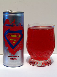 It's not often I get to try a drink that has a theme tune. DUH DADA DA DA, DAAA DAAA DAAAAAAA! Yay, Superman. This is an exclusive of Woolworths supermarkets in Australia, and according to the can:
"SUPERMAN Energy Drink is a deliciously refreshing energy drink that contains Taurine and Caffeine. It helps to charge physical & mental performance throughout the day by providing extra energy power to your body."
Intriguing. A drink that claims to last all day!
It's red. It's very, very red. Upon initial pouring, it actually produces a small amount of red foam, which is possibly the coolest thing ever. Did I mention it's red?
It smells like kryptonite. Or what I'd imagine kryptonite would smell like. If kryptonite was made of Red Bull, anyway.
It doesn't taste as red as it looks. It's quite similar to Red Bull, my perennial benchmark, but it's not as sweet. As a result, the base flavours of vitamin-B and caffeine show through a lot more. This doesn't actually make the drink unpleasant, though, it's oddly refreshing to drink an energy drink that doesn't have the horrid oily sweet flavour trying valiantly, but in vain, to hide the flavours that are "good for you".
It doesn't hold up to the warm drink test. All sweetness disappears entirely, leaving only bitterness and defeat. It's like drinking Lex Luthor's urine. If Lex Luthor's urine tasted like turpentine and vitamins.
The aftertaste of B-vitamins is stronger than usual, presumably because the masking flavours are thinner than usual. It's not exactly pleasant, but I've definitely had worse.
It gets points for being so freakin' RED. It gets points for having fairly awesome can art (although I personally think it's got too much silver and not enough super). It gets points for being called Superman.
I have no complaints about this drink. It's pleasant. I think Superman would approve.
'90s Game Boy Adverts
I recently came into posession (again) of a massive quantity of video game magazines from circa 1992-1998. These had been buried in a wardrobe at my parents’ place. The purpose (or motive, really) of this article is that I’d intended to dig up as many of the old Game Boy adverts as I could find. The ones that followed the “Game Boy: More fun than..” routine. I got somewhat sidetracked and scanned the following gems also.


James Rullis Tidbit #1: James resigned from a hairdressing apprenticeship to star in the Game Boy adverts.

James Rullis Tidbit #2: When James auditioned, he was asked to mimic having a bulldog clip attached to his ear. When they filmed the actual commercial, he was shocked to find it was a real clip they stuck on his lug!

James Rullis Tidbit #3: After making the advertisements, James claimed he “got stared at a lot, got a lot of strange looks, and people whispered about him, wondering whether he was the guy from the ads”. And that quote was paraphrased poorly to keep it grammatically in-sync with the sentence it was crowbarred into. Also, James claims the adverts once encouraged a girl to ask him for a kiss! No information is provided as to whether a) a kiss ensued, b) the girl was attractive or not, or c) was indeed a girl at all!
The '90s were cool in a way no future decade ever has, and likely ever will repeat.
Hello I'm made of pixels
Super Star Wars was released in about 1872. At the time, it had splendiferous graphics. Of particular note, virtually every character from the (then only three movies wide) Star Wars movie universe was represented in a little 16-bit sprite. I intend to have a look back over said characters, and see how well they really fared.
Boba Fett.
Fresh from his annual visit to the Coruscant Shoulder Pad Enhancement Studio, Fett sports unusually stumpy shins and a new Dragonball-Z inspired colour scheme.
Lando Calrissian.
Wearing an inverted stop-your-pet-from-licking-its-wounds cone and astronaut pants, Lando’s grinning wildly within a four-pixel radius.
Yoda.
I….I don’t know what the hell that is. At some point between The Empire Strikes Back and Super The Empire Strikes Back, yoda became a small greenish-blue peanut. Well, there you go.
R2D2.
I don’t remember Artoo’s legs being collectively as thick as his body. At least his little light is red.
C-3PO.
Threepio now sports an unexplanable coppertone tan, and has lost all of his facial features. At least his eyes will be safe from Salacious Crumb, now.
Emperor Palpatine.
Not so much the brooding Galactic emperor that put the fear of the Dark Side into you, Palpatine is now resplendant in a blue velour dressing gown and has borrowed C. Montgomery Burns’ walk. Apparently the Dark Side doesn’t cure arthritis.
Jawa.
Oo-teeny. I hated these things, they make the most annoying noises. They also weild Nintendo Super Scopes, apparently.
Tusken Raider.
It’s a hessian sack with an eye. Somewhere in the reality-to-pixels conversion, the sandpeople lost all of their facial distinction, and now appear as cycloptic homeless people.
Obi-Wan Kenobi.
The Alec Guiness one, none of this Ewan McGregor crap. His beard’s a bit longer, he seems to have a paunch. The desert’s been good to old Ben.
Bib Fortuna.
For some reason, Bib always reminded me of John Inman. Since I realised this, I’ve concluded that Return Of The Jedi could only have been improved by the actual presence of Mr. Humphries. For some reason, in Super Return Of The Jedi, Mr. Fortuna gained the ability to shoot pellets of burning something-or-other from the tip of his longest tentacle. I'll leave determining the significance of this as an exercise to the reader.
Oola.
Jabba The Hutt’s dancer, largely famous for being the only character in the Star Wars series to have flopped her boob out (Jar-Jar not withstanding, he simply was one). She’s now taken to skipping rope, and markets a splendid new line of purple leg warmers.
Luke Skywalker.
Here’s a nice piece of video game evolution, for you. On the left, we see Neanderthal Luke, hunched over and wearing a hessian bag. Central, we see College Luke, uniformed and upright, making a good impression on all. On the right, we see Goth Luke, hardened to adversary and dressed in black leather, weilding his Greenpeace-savvy verdegris lightsabre.
Chewbacca.
The old walking carpet is now an indistinguishable vertical sausage.
Han Solo.
That’d be Indiana Jones with his hat off, to you and me. Han has an inexplicable red stripe down his otherwise shmick pantaloons.
Darth Vader.
Vader’s typical dark attire takes on an unusually colourful hue, presumably because the sprite was designed to match the environment it was originally found in. Unfortunately, the sprite, originally located in the Ughnaught Mining Factory on Bespin, was lated placed in the Emperor’s Chamber on the Death Star, where no such colourful lighting existed. So Vader was having a disco all of his own, and the Emperor wasn’t invited.
I apologise for the crappy update. I’ve been busy, and truth be told, I just wanted to put the words “indistinguishable vertical sausage” to good use.


