Building Darth Vader's lightsaber

This is one of those things everyone should do. Everyone should own a lightsaber, and everyone should -- ideally -- build it themselves. This is my version of Darth Vader's lightsaber, built from PVC tube and various bits of junk.

Enjoy.

Step 1: Search internet for blueprints and dimensions. This is not difficult. I'd suggest searching for something like "darth vader lightsaber dimensions", or such. Use your imagination.

Step 2: Figure out your scale, if you need to. I have PVC tube in 42mm, which is awfully close to the 40mm barrel the original Graflex-style hilt was built with, so I'm pretty content to go with that, and I chose not to adjust any of the other dimensions, as two millimetres didn't seem enough to bother with.

01

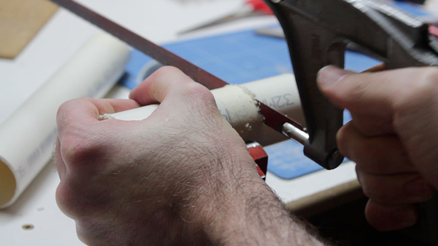
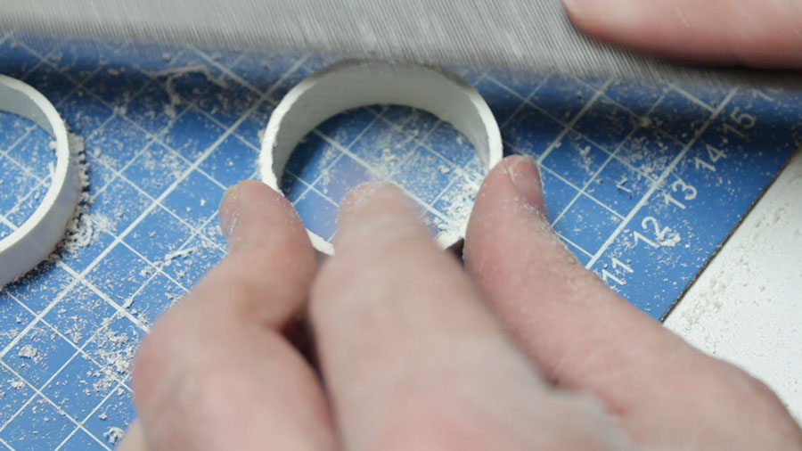
Step 3: Cut the tube to the right size and cut the end off at the appropriate angle. A mitre box, or a mitre saw/drop saw/compound saw/whatever would probably be cool for this. I didn't have any of these things handy, so I just marked the end and hacked it off with a hacksaw with plenty of plastic to spare and set about filing it down to the correct marks.

02

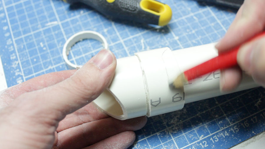
Step 4: Vader's saber has an extra-thick cowling around the emitter with a rectangular box on the side. I made the thicker cowling by adding an extra piece of 42mm PVC tube around the outside of the main tube.

03

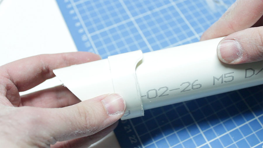
Again, I knew I would make a total balls-up of the angled cut, so I hacked it off with some PVC to spare and filed it down to make a "machined" edge. There you go, a double-thickness cowling.

04

Step whatever: There's an additional band at the base of the cowling, which is thicker again. Same process. This bit requires an extra part cut out, as it flares toward the switch side of the saber.

05

File it.

07Mark the bit to cut out.

10

Cut out said bit, and you've got the beginnings of a saber emitter cowling.

IMG_8848Step orange: The various layers and thicknesses of PVC create some pretty ugly gaps. Only one of these needs to be fixed with any real quality, the rest will get covered up by the rectangular box contraption we're about to build.

IMG_8849

This is clear acrylic. Clear acrylic is awesome. It's awesome for a bunch of reasons:

  • It's easy to get it to the right size, you can just score-and-snap the stuff
  • It sands beautifully
  • You can drill and dremel the bollocks out of it, because it doesn't melt or burn until it gets to surface-of-the-sun temperatures

To make the rectangular box on the cowling, I layered various bits of acrylic and styrene, and did some incredibly rough filling.

IMG_8850

Another piece of acrylic, this one measured to be the diameter of the triple-layered PVC tube it's sitting on top of. It should be exactly the width of the tube. This is important. Kind of.

IMG_8851

Join the whole thing together, and fill and sand until it doesn't look like crap. What I've done here is pretty much make a box, using scrap acrylic and some odds and ends of styrene sheet. I like using styrene sheet for the parts that don't necessarily need to hold much weight, or are only decorative. It's thin, but it looks solid when it's all painted and good to go. My adhesive of choice for this project is super glue, and lots of it. Super glue can be accelerated by using bicarbonate of soda, which:

  • sets the glue instantly
  • sets itself instantly, and very much like a rock
  • can be built upon in layers to fill space
  • can be sanded to a very nice finish
  • generally fills flush with any surface

It's essentially magic and witchcraft. And it's awesome.

IMG_8852

Step parsnip: Make rectangular box look decent. My approach to this is to add layers, then sand back, then add layers, then sand back. Superglue and bicarbonate of soda is pretty much the undo button of sculpting and carving stuff like this. Screw it up? Add more. Too much? Sand it away. Just don't breathe the fumes or stick any important parts of your body to things you don't want them stuck to.

Here I've also filled the channel at the top, where the cowling tube splits apart. 1mm styrene sheet and some superglue and baking soda. Perfect.

IMG_8854

Sanded and pretty much finished.

IMG_8855

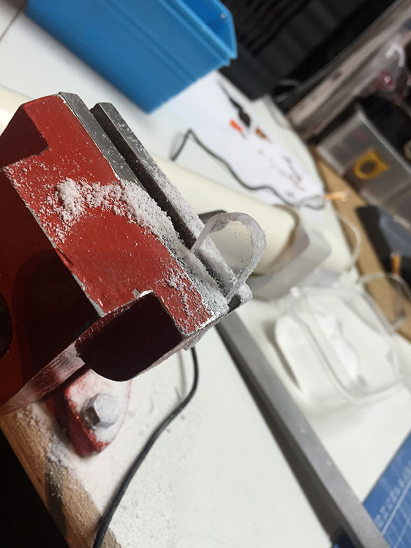
Step squeeble: This is three layers of acrylic glued together in a vice, getting filed down to be the little control panel on the top of the saber.

IMG_8856

Step 1,493: Build control box and clamp details. The clamp strip is a piece of sheet metal from a clothes dryer duct, which happens to be awesome for lightsaber clamps. This is why you should never throw away anything that looks like it could be useful.

I didn't document building the control box, as the process was pretty much:

  • cut rectangles
  • glue together
  • attach to saber

The ends of the clamp strap are detailed with some AV wiring. This is sometimes a mistake, as some kinds of paint make the rubber insulation on electrical wiring sticky, and they never stop being sticky. In this case, I appear to have dodged a bullet, and the wires remain stick-free.
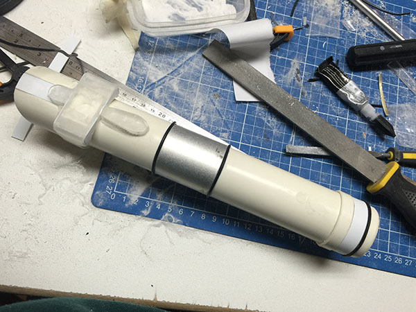
IMG_8858Progress so far, and a messy work area. I've used similar techniques to build the end cap on the other end -- cut and split some PVC tube, add detail using styrene, and a piece of AV wiring for the rounded detail.

IMG_8872

Step weasel: A coat of primer usually identifies all of your flaws. There are some chunks in the PVC pipe that will need filling and sanding. Here, I've cut two out of the six vent holes in the casing. I ultimately decided to only cut four -- two on each side -- as I was happy with how the outer four holes looked, and I had some concerns that I would not get the inside two holes perfectly aligned. I'd prefer it looks properly made and inaccurate than accurate with flawed construction. Things like that annoy me.

IMG_8874

Step SILVER: Chrome the hell out of it. Here, I've coated it with a liberal lashing of Krylon classic chrome, and am in the process of masking out the black parts to be hit with some glossy black.

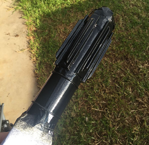
Step BLACK: Here's the black. I made the executive decision to make it a fairly thick coat of black, as the paint that I have tends to decide on its matte level based on how thick the coat of paint is, and I wanted this to be as glossy as possible. If you take this stupid approach, be sure to hold the painted object by hand and move it around a lot, so any drips don't kind of well up in the low points and screw the paint job entirely. After much gyrating and swearing, the paint finally dried enough to put the thing down.
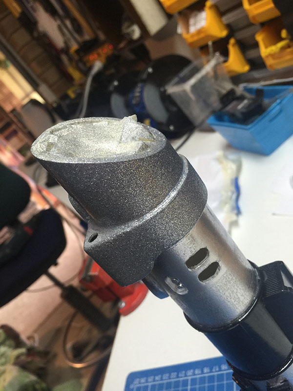
IMG_8879Step Gary Glitter: Now we're getting risky. I knew Darth Vader's saber had a weird kind of cast-iron effect on the emitter cowling. It's lumpy, and very, very matte black. I originally planned to use granite-effect spray paint to achieve this, but the stuff is expensive and I didn't want to waste money on something that might not work. So I wasted less money on something that might not work.

For half the price of the granite paint, I managed to find some glitter paint, which also imparts a texture to whatever you paint with it. Turns out the vile shite is just particles of glitter suspended in clear varnish, which, when sprayed, spit in all directions like a hurricane of shiny snowflakes and proceed to stick to everything. Given that glitter has a propensity for sticking to everything when it's in its natural state, this combination is truly terrifying.

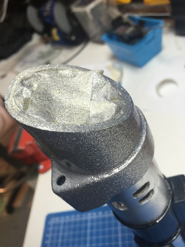
Regardless, I masked off the end of the saber and coated it three times in Rustoleum glitter paint.

IMG_8880

GLITTER.

IMG_8881

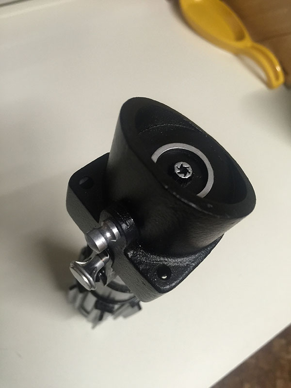
Step farfalarganfarful: While waiting for the umpteen coats of craft herpes to dry, I started building the emitter's internals. These did not turn out as detailed as I had hoped, as I was a) impatient, and b) running out of useful parts. I ended up making a wee cylinder to stuff down the end, by cutting some PVC tube and splitting it so I could reduce its diameter, then cutting a disc of acrylic to go in the end. The detail on the emitter is a smaller piece of PVC tube, and the end of a wall plug. High tech.

IMG_8882

The ring should really be larger, but it's all I had lying around, and I usually have zero patience when a project is nearing completion. You can see the end of the saber hilt in the above image, too. I added an additional strip of corrugated styrene to the very end, giving a kind of grip-like appearance to the endcap. It looks awesome drowned in chrome paint. (Lets face it, everything looks awesome drowned in chrome paint.)

IMG_8885

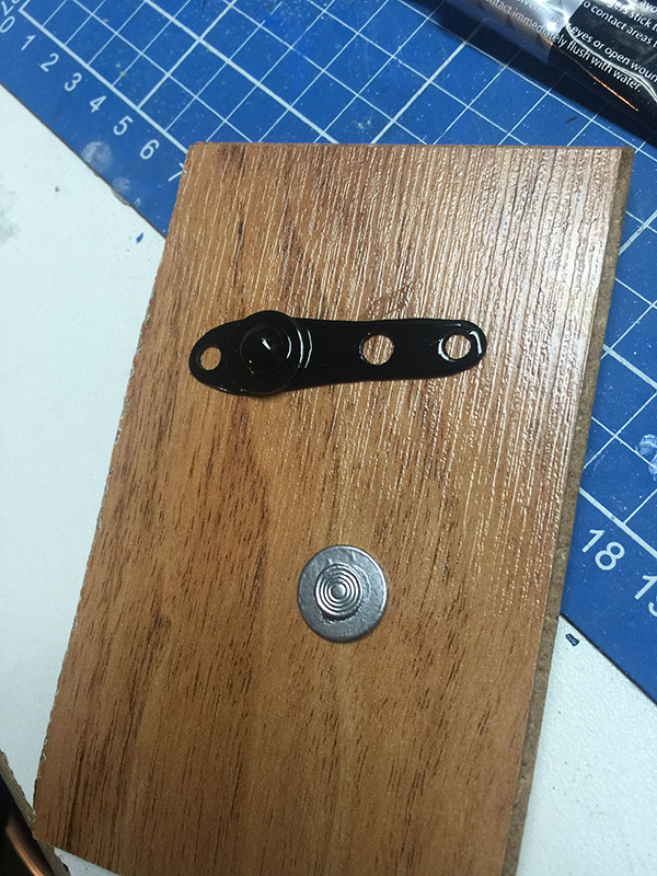
Step flurple: This is the switch, which is made from three pieces of acrylic glued together and clamped, then filed within an inch of its life until it resembled the switch from Vader's lightsaber. I drilled the 4mm hole starting with a .5mm bit in my Dremel and progressively scaling up the bits, so that I could be reasonably sure the drill wouldn't wander and end up making a stupidly off-centre hole, or something. One of acrylic's best features is that it drills really, really nicely.

IMG_8886

Primer on the switch. Yes, there's a gouge in it. No, I don't care. Life's too short for that kind of thing.
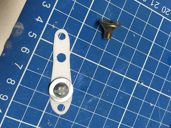
IMG_8892Step eleventy squillion: Details to go on top of the saber. The plastic shape is styrene, designed to fit over the acrylic extrusion I made earlier. On top of it is a washer and a screw, the head of the screw is filled in with superglue and sodium bicarbonate so that it doesn't look like a screw anymore. The bugle-headed plasterboard screw will substitute for the flanged....dial....thing...on the top of the saber. It's kind of the right shape. I'm getting impatient, here. I ended up sticking a washer on top of the bugle-headed screw and filling the washer's hole with superglue and soda, just to disguise it obviously being a plasterboard screw.

IMG_8893

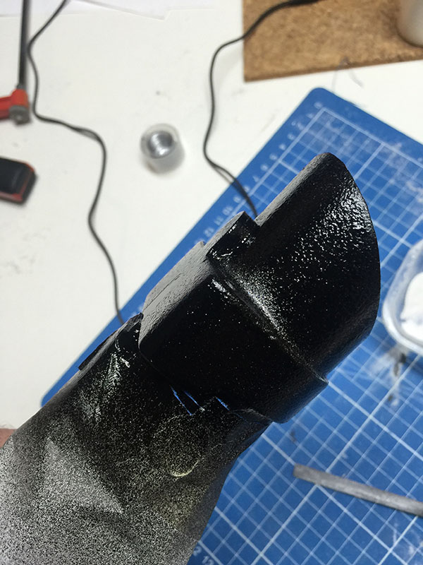
Step boo-urns: One of many coats of super-flat black spraypaint on the saber cowling. The texture from the glitter paint shows through quite nicely.

IMG_8895Texture ahoy!

IMG_8896This is starting to look a bit like a lightsaber. The emitter is now in place. I've also built some grips for the handle. They're nothing elaborate -- flat pieces of acrylic, some with the edges smoothed out, some with some angular corners. I didn't take photos of the process. I'm sorry.

IMG_8898

At some point, I've also put some flat pieces of Styrene painted with Krylon classic chrome on the sides of the control box.

IMG_8899

Step AHOOGAH, AHOOGAH: Some more details. The knobs-and-buttons thing makes a re-appearance, this time with paint. I thought I'd made a tragic mistake by painting the bizarre styrene shape with spray paint (and primer), because it started to eat the styrene and the whole thing ended up turning to glue, but something weirdly fortuitous happened: It just rounded the edges off perfectly, leaving a really nice gloss finish. So, uh, yay. Or oops. Depending on how you look at it.

Bottom bit is a washer with the head of an upholstery nail attached.

IMG_8900Washer/nail combo ended up on the side of the control box, here, where it serves some purpose best known to the Empire.

IMG_8980

Step doobly-doo: The small bolt/knob at the end doesn't look a great deal like the original, but it does the job. For this, I used a piece of acrylic rod from a paintbrush handle and lathed it in a drill with a rounded file to create the shape. I didn't document this process as I was concerned that I could die if I was distracted whilst lathing a piece of plastic wedged in a drill, wedged in a vice. Perhaps next time.

IMG_8981

The finished product. A reasonably accurate version of Darth Vader's lightsaber. It now lives in a cabinet along with a bunch of other junk.

Hooray!

Why Geordi La Forge is not a great character

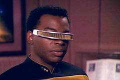
Don't get me wrong -- I like LeVar Burton, and I like what he did with the character. And he did considerable things, because he had very little to work with. I CAN SEE YOU

So, what are Geordi's defining traits? He only has two of them.

  • he's kind of blind
  • he's not good with women

And that's essentially it. You're probably wondering about the "kind of" qualifier attached to Geordi's blindness -- he's not blind. He has a gizmo that allows him to see. He has a disability, but he doesn't cope with the disability inasmuch as in 99% of episodes, he doesn't have a disability. He is not in any way different to any other character, save for a hair barrette over his eyes. Supposedly Geordi suffers from headaches as a result of wearing the visor, but that's not mentioned very often, and it was virtually never a plot point.

I guess this is something that's charming in hindsight. We can look back at the '80s, and see that it was normal and acceptable for a TV show to have a token minority character -- in this case, a vision-impaired guy -- but it was also okay to sidestep the dramatic handicap (no offence intended) of having to regularly acknowledge and deal with the character's difficulty or inability to perform tasks by simply handwaving the disability with technobabble and completely ignoring it.

Geordi's blindness and his VISOR gadget were mentioned a few times, for example:

  • the pilot episode "Encounter at Farpoint" has Dr. Crusher give Geordi an examination, leading to the introduction of the headaches the visor causes, and a bit of techsplanation of how the thing works
  • in "Heart of Glory" we get to see through Geordi's visor for the first and last time (sort of, more in a moment)
  • in "The Enemy", Geordi's VISOR fails completely, rendering him genuinely blind for about half an episode
  • in "The Mind's Eye", Geordi is brainwashed by Romulans who jam horrible imagery directly into his VISOR's implants, and then use the VISOR's carrier frequencies to remote-control him
  • "Parallels" had Geordi as the cause of Worf's quantum universe shifts, as his VISOR emitted some kind of frequency that caused the Klingon to leap between dimensions
  • in Star Trek: Generations, the two Klingon sisters stick a webcam into Geordi's VISOR to watch him bathe (not making this up)
  • in Star Trek: First Contact, they gave up on it entirely and just gave him some mechanical eyeballs

Apart from the one episode -- "The Enemy" -- where Geordi is blinded because EM interference on the planet he's stranded on fries his VISOR, his blindness was never genuinely used as a unique plot point.

I think it may not have hurt to have limited Geordi in some way, rather than giving him a tool on his face that actually allows him to see stuff a sighted person cannot. (Infrared, EM radiation, etc.) Most characters are built upon something that's lacking, not an additional ability. Picard lacks family connections, Data lacks (but desires) emotion, Worf lacks other Klingons, Spock lacks (but does not desire) emotion, Odo lack(ed) any knowledge of where he came from or what he was, The EMH lacked a name, Neelix lacked decorum. All of the best characters were absent something.

All Geordi was really lacking was skill with women.

Why the Super Mario Bros movie isn't that bad

It's certainly not that great, either, but I intend to play devil's advocate here, so give me a chance. smb_movie

It HAD to be made, and the source material is ridiculous. It was utterly inevitable that the Super Mario Bros. movie was going to happen. It was released at the peak of Nintendo's popularity, right after the Super Nintendo hit the shelves. If Caruso, Eberts, Joffe and Weston hadn't made it, someone else would have. And it would have still sucked, because the source material is absolutely ludicrous. There's no way to turn "plumbers descend pipes, find mushroom land" into a movie that everyone will like, let alone one that anyone will like.

It was the first movie based on a video game. While the original is occasionally the best, more often than not the first version of something is riddled with flaws and gets perfected over time. Video game movies are very much the latter. While no movies based on video games can really be described as awesome, there are certainly later films that are better than this one (Mortal Kombat, Tomb Raider, Silent Hill). I suspect part of the difficulty in developing a film based on a game is that films by their nature remove the most powerful aspect of a video game -- interaction. The story is set in stone. What makes a video game movie enjoyable is how cleverly it deviates from the expected, yet how true it remains to the source material. More to come on that.

Super Mario Bros. has the bones of a good movie -- the protagonists are likeable, the villain is appropriately detestable, the love interest is attractive, the comic relief is amusing. The story on a whole is a fairy tale and a take on the hero's journey as the two Brooklyn plumbers learn of a new, hidden world, and pursue an adventure there, becoming enlightened heroes by the end of the film. The loose end in the development of this film is that the source material -- the video game -- has a pretty stupid story that doesn't translate at all to a film without some serious modification, and even then, without setting the entire thing within a character's hallucination, it's still going to be batshit crazy. I suppose it's no less batshit crazy than the universes of, say, Labyrinth or The Neverending Story, but Super Mario Bros. doesn't really pretend to be a fantasy movie. Again, this all falls back to the two points I've made above: the source material is ludicrous, and no one had made a movie based on a game before.

A lot of elements of the game's story were changed for the film, and were probably changed for the best. Thanks to Jurassic Park, which was released a year after Super Mario Bros., but was well in development while Super Mario Bros. was being filmed, there are a lot of dinosaurs and reptiles in the Mushroom Kingdom. This is presumably an extension of the Yoshi character from the video games, who is represented as a kind of midget velociraptor in a couple of scenes in the film. There's not a lot of consistency in what's a reptile and what's a fungus, though.

The old king of the mushroom kingdom was "de-evolved" from a (presumably) humanoid form into a huge fungus, while most other creatures are de-evolved into goombas (small-headed huge-bodied reptiles). There's no explanation as to why the king evolved from mushrooms. There's no explanation as to whether the king's daughter, Daisy, is also made of fungus. Nor is there any explanation as to why Daisy keeps a pet dinosaur, given that the villains are established to be reptilian. Nor is there any explanation as to why everyone else seems to de-evolve only into reptiles. Was the king the only fungus-ancestored being in the Mushroom Kingdom?

It took me a while to figure out that the old king, who has de-evolved into a pulsating pile of fungus, was simply de-evolved further than anyone who became a reptile. Presumably if one was to de-evolve a goomba, it too would become fungus. (Although goombas were evil mushrooms in the video games, if I recall). All of this then begs the further question of why is there such discrimination between reptiles and fungus if everyone's ultimately fungus anyway...

Although if that's the case, why did King Koopa de-evolve directly into green slime without passing through a fungal stage? A little bit of consistency goes such a long, long way.

There are a lot of nice elements that reflect the video game, such as the tiny wind-up Bob-omb, the Thwomp bar, the Koopahari Desert. Some insane elements of the game that would play out very poorly in live action are handled nicely, such as the jumping boots that allow Mario and Luigi to leap huge distances.

I still enjoy watching Super Mario Bros., largely because it brings back memories of the time it was released, and because it's not the worst film ever made. I forgive it because it had to be made, and I can't see any real way it could have been made better. I forgive it because it's not drowning in plot holes. I forgive it because the production values are pretty high. I forgive it because it's based on source material no one should be burdened with as a starting point. I forgive it because Bob Hoskins.

Rest in peace, Bob.

Innermost Resonance: Præteriit continues

Here's another track to go with the four in the previous post. This one is more of the usual material, some airy nonsense with fake piano and guitar sprinkled on it. A lengthy piano outtro is never a bad thing, though.

If you have an opinion about any of these musical bits and pieces, please post it below. I'd appreciate any feedback, if only so I can decide whether it's worth continuing to toss this stuff in the internet's general direction.

Some cover art to stick into your iTunes or your iPod or your Zune or whatever you listen to music with. Does anyone use a Zune anymore? Did Zunes even exist? Am I making this up?

Fine FAWM: Præteriit

I wanted to participate in FAWM this year, and I gave it a shot, but ultimately I just ended up with a heap of unfinished junk. So, as you do, I've polished the junk up, and now it's called Præteriit, and it's on Soundcloud polluting the ears of random internet passersby. You can listen to all four tracks below, if you feel so inclined.

What you get for your money, ultimately, is something pretty similar to everything I've done before, with loads of pads, too much piano, considerable overuse of the Dsus2 chord, and fairly repetitive chord structures.

There's nothing wrong with being your own worst critic. You should try it some time!

Here's some cover art, should you wish to stick it somewhere. (Your options are varied.)


Not very good: Thoughts on Wolf Creek 2

No. Redeeming. Qualities. This movie has no redeeming qualities.

I shall summarise in point form my various opinions, because it's all I can be bothered to do. This will be pretty much entirely spoilers, but given that the movie's already spoiled by virtue of being terrible, there's not much to lose.

  • The character of Mick Taylor, such as he is, isn't really strong enough to warrant an appearance in a sequel. He was cool in the original Wolf Creek, because he was new and interesting, but he hasn't changed since then, and he's still just a stereotype. He's essentially Jason Voorhees with an Australian accent.
  • There were numerous moments throughout the film where I expected something to happen, but it didn't, and the outcome was not as interesting as I was expecting. Case in point: When Ryan Corr's might-as-well-be-nameless character is trouncing about in a paddock in his orange Jeep, relatively free and unscathed after having removed the dead backpacker from his car, I expected the story was going to shift to a vendetta story as Paul (evidently that was his name) becomes the hunter, and Mick the hunted. This did not happen.
  • The whole "Who Wants To Be A Millionaire" scene goes on far, far too long, and nothing useful comes of it. This was a perfect opportunity for some character development for Mick (something he desperately needs), but instead we spend twenty minutes singing drinking songs and playing trivia.
  • Actually, speaking of character development for Mick: He's basically the personification of the Alf Stewart internet meme. Except the Alf meme has had more character development.
  • How many times did the writers get to the end of a scene, realise there's not really much they could do to actually end the scene, so they just knock one of them unconscious and change locations? (Four, if you're curious.)
  • Another scene that disappointed: I had expected the old couple in the farm house to turn out to be Mick's parents, or something. Another opportunity for character development, and an awkward situation, to boot. Didn't happen.
  • There's a really nice shot early in the film, during the blue-truck vs. orange-Jeep chase, where the dust from the Jeep is illuminated by the spotlights on the truck as they speed through the empty landscape.
  • Why does Mick have catacombs beneath his dwelling? Wait, was that where he lives? Didn't he live in a junkyard in the original Wolf Creek? Still, why are there catacombs in the Northern Territory? Did Mick build them himself?
  • Was it truly necessary to have the first twenty minutes of the film in German with subtitles? Does the expected demographic for this kind of film appreciate subtitles? Did I just generalise horribly? Yes. Yes, I did.
  • On the up side: nice use of animal sounds for Mick's various vehicles.
  • Kangaroos. Why?

People I supposedly look like

I have, over the years, been accused of looking like various people. I'm not sure if I do, but hey. Here are some of the more accurate ones: Jamie Oliver. Resemblance: 0%.

Jamie Oliver I was once told I look "a bit" like Jamie Oliver. By "a bit", I assume the person meant "not in any conceivable way", as I do not, in fact, resemble Jamie Oliver in the slightest. I also cannot cook.

Nick Cave. Resemblance: 10%.

Nick Cave I'm not entirely sure that I can agree with my alleged resemblance to The Bad Seeds frontman Nick Cave. I can't entirely disagree, though. When I was younger, I had a similar hairline. (Now, I cling to the belief I have a hairline at all.)

Brian Thompson. Resemblance: 25%.

Brian Thompson Mr. Thompson is probably best known for the role of the alien bounty hunter in The X-Files, but he's had a few other recognisable parts, including roles in the Buffy the Vampire Slayer series, and the Mortal Kombat movies. I look a bit like him, but only when he was younger. He's…changed.

Nicholas Hope. Resemblance: 50%.

Nicholas Hope British character actor well known for his appearance as Bubby in Bad Boy Bubby. Yeah, I look a bit like him. But I look like Nicholas Hope, not Bubby. It's splitting hairs. I know. You would, too.

Hugo Weaving. Resemblance: 90%.

Hugo Weaving You probably know Hugo from The Matrix, the Lord of the Rings series and Captain America. I know him as "that guy I kinda look like". This is not news to me. I've been told this for decades, now. (Boy, how I love being able to measure time in decades. Screw you, getting old.)

looklike_trevorphillips

Trevor Phillips I also bear a passing resemblance, apparently, to a fictional nutjob in a violent video game. At least it's a popular violent video game.

And it's not Pokemon.

Could be worse.

Heroes of Science Volume III, now +21

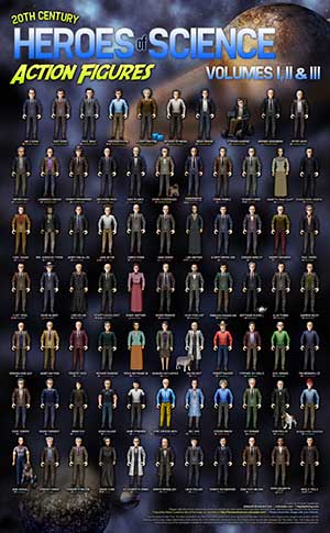
HeroesofScience_Fullsize_V3_tinyprev I've just posted the third edition of Heroes of Science, which features another 21 science heroes, including Brian Greene, Peter Higgs, Lawrence Krauss, Wolfgang Pauli, Henrietta Swan Leavitt, Albert Michelson and Edward Morley, Andrei Sakharov, David Hilbert, Lord Kelvin, Emmy Noether, Srinivasa Ramanujan, Andrew Wiles, Norman Borlaug, Barbara McClintock, Tim Berners-Lee, Steven Pinker, B F Skinner, Konrad Lorenz and Edward O Wilson!

You can check it out at DeviantART, and there's an FAQ over here.

Thanks, everyone, for your support and comments on the various incarnations of the Heroes of Science figures. You can find more posts on colonpipe.com about them by clicking this linky thing here.

Buses, vans and subway trains

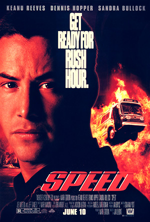
speedJan de Bont's Speed (1994) is a pretty stock-standard action movie. It has a pretty clever plot. It involves Keanu Reeves and a bus. You've probably seen it. What you may not have noticed, however, is the worst throwaway line in movie history.

(And that's saying something, considering Speed contains such dialogue gems as "It's cans, it's okay, it's cans".)

There's a moment toward the finale of the film where an extra spouts a line of dialogue. There's no real reason he has to say anything, but he does anyway. I can picture the editing room: the scene is cut, the audio is laid in, and the director and editor are arguing over whether a soundbite needs to be overlaid as the extra does his thing. The correct answer is "no". The answer they chose to go with is "sure, lets see if we can dig up something that seems relevant enough", followed with the addendum "but really isn't".

They've clearly rifled through all of their available chunks of pre-recorded dialogue, hoping to find a sound clip that fit. And when I say "fit", I mean "with a shoehorn and vaseline".

Keanu Reeves and Sandra Bullock ride the remains of half a subway carriage as it roosts through the pavement of an unfinished railway station and skids down three or four blocks of a Los Angeles street -- on its side -- before coming to rest against a blue minivan. The driver of the van climbs out, bewildered, staring at the bizarre sight of an upturned and halved railway train on the roadway. And he says:

"I can't believe he hit my van."

No one would say this. A more appropriate outburst would be "HOLY SHIT, A RAILWAY TRAIN", or "JESUS, THAT WAS LUCKY, I'M STILL ALIVE".

This may be the worst line since "You're the man now, dog", and I think Speed is all the better for it.

Simulation III

SIMULATION III coverMore music for your long-suffering ears. Here's a three-part piece with a bunch of different things going on. Much of it is general progressive fare, part diverges into a bit of sea shanty, and there's some fairly melodic piano in places. It's long -- 15 minutes -- but it's made of three separate pieces that share a theme, so, y'know. You get that. Influences for this include Porcupine Tree and Sting, which are about as disparate as things can get, really.

Enjoy. Or don't. You choose. Feel free to comment either here or on its Soundcloud.

On climate change, because nothing's sacred

Opinions. They're like arseholes: everyone has one, and they all stink. For what it's worth, here's mine, vis-a-vis climate change. You can take it or leave it. It's pretty brief. I don't care if climate change is 'real'. The net outcome of having people, in general, do the correct thing outweighs any political shenanigans that are going on behind the scenes.

PumpkinCloud

Let's suppose that climate change is real. What's the best we can hope for? The best we can hope is that people will comply with the basic instructions they're being not-so-subtly given. Look after the environment. Switch to alternative fuels. Be energy efficient. Waste less. Use less. Be, in general, healthier -- both in your life, and for the planet you live on. What's the worst we can hope for? We're screwed.

Now let's suppose climate change is not real. I don't have an opinion either way. As I said above, I don't care if it's real or not. I do believe, however, that the underlying issues are very real: We will, one day, run out of fossil fuels. It's inevitable. They're non-renewable. Once they're gone, there are no more. We need to find alternative energy sources, and if they're ultimately renewable ones, they'll eventually end up cheaper, more reliable, and more efficient than what we're currently using. We need to look after our environment. Whether all of the crud we're pumping into the atmosphere is causing climate change is entirely moot, the point is: we're pumping it into our atmosphere. We're having small-scale, detectable effects on our immediate surroundings. We live in smog-covered cities. We need to, generally speaking, clean this shit up. So, supposing climate change is not real, our best-case scenario is a cleaner, more efficient, more advanced world than the one we live in. What's the worst we can hope for? Well, I suppose we can live in shit.

It's an option.

As an addendum: I find the whole climate change debate to be akin to the argument than man never walked on the moon. At the end of the day, unless you're a climate scientist in your own backyard, you're relying on other people to supply you with the data you're basing your argument on. Often, those people are the ones you're arguing against, a task that has some pretty obvious flaws. You can believe what you please when it comes to man walking on the moon, at the end of the day, the people holding all of the proof are the ones trying to convince you. Unless you've got a spaceship of your own, you'll never know for certain. I'm starting to think climate change is an awfully similar argument from the average Joe's perspective.

Nonlocality

Nonlocality CoverSome more original music, such as it is. The title is a nice quantum physics reference that has absolutely no relevant bearing on the music, but hey -- it may have no bearing on reality, either. That's the nature of quantum physics. It's bullshit you can believe in! The track is mostly guitar and piano, none of which is real. (Maybe that's the link to quantum physics, right there.) It has a few moments I'm pretty happy with, particularly the chord change at around 2:20, and the overall feel. Sometimes things just work. Sometimes they don't. I'm usually pretty happy any time I can come up with something that doesn't orbit ineffectually around Dsus2 and G minor. It's the little things.

Album art provided above and to the right a bit, should you wish to jam this into iTunes or something. It's better than a grey box with a symbol in it. Just. Besides, everything's better with an album cover.

Oblivious: Thoughts on Oblivion (2013)

Yeah. Yeah, spoilers. And stuff.

Oblivion.

It's very pretty, but not very good. The story is poorly paced, awkwardly revealed and thoroughly confusing. It also has Tom Cruise in.

The story, such as it is, is set in a post-apocalyptic future where the Earth has been ravaged by the final blow of a war with an alien force. We "won", having scorched the planet with atomic hellfire, repelling the aliens but leaving our planet barely habitable. The surviving humans fled to a bizarre pyramid-shaped space station in orbit, leaving a few of the invaders scattered about, doing what they can to survive on the surface. Meanwhile, the future of humanity is assured by giant machines that float over the oceans, sucking up the water to use, ostensibly, as fuel for a trip to the nearest habitable rock -- Saturn's moon of Titan.

Tom Cruise is Jack Harper, a technician who lives in a peculiar house on top of a pencil-thin tower with a vacuous British redhead that operates a talking table all day long. His job is to fly his mechanical dragonfly down to the surface to repair security drones that patrol the ocean-sucking machinery, keeping it safe from the aliens.

From here, it all goes to shit. Big spoilers to follow, for more than one film. I don't care. I like to live dangerously.

Tom ultimately discovers that he's a clone, apparently designed after one of the only two surviving humans, and his purpose is to continue to maintain the technology of the "humans" aboard the pyramid in the sky, which is not manned by humans at all, but by the alien invaders. Alien invaders who aren't harvesting the oceans for fusion fuel for a trip to Saturn, but simply raping the planet of all its remaining natural resources.

So, Tom's a clone. That sounds familiar. How did he find out he's a clone? He discovered a duplicate of himself, doing the same job he should be doing. Still sounds familiar. Why does it sound familiar? Oh, yeah. Moon. Sam Rockwell did it so much better.

After this reveal, the rest of the film falls roughly into place, following two additional reveals that really didn't take me by surprise. I have to admit, I was a bit taken aback by how blatantly the key plot point from Moon was "borrowed", and I lost a bit of enthusiasm for Oblivion's remaining twists. The biggest plot hole still revolves around the clones-of-Cruise idea, though.

The original Jack, imaginatively labeled "Jack 49", meets up with a duplicate of himself in the middle of the desert, attempting to repair a drone. They proceed to beat the crap out of each other, ending with Jack 49's revived wife being shot, and Jack 52 (the other Jack) being crudely tied up and left in the desert while 49 rushes the shot wife to a nearby cave and steals 52's helicopter-dragonfly to go get her some magical fixer-upper drugs from 52's pole house. This is all fine and dandy, except:

Jack 49 apparently borrows Jack 52's clothing (they have numbers and colour coding on them) in order to convince Jack 52's own version of the cranky British redhead that he's her colleague and not some clone of him. He then somehow swaps back to his original 49 uniform before the story continues, which is fine. Well, sort of. It'd be fine if Jack 52 himself didn't up and disappear entirely until the unsatisfying end of the film. I don't know if the changing number on the jacket is a continuity error or an intended thing, or what. If it is a continuity error, it's a fatal error because the story relies on very subtle hints about what's going on, and the number and colour of Jack's uniform is pretty significant.

Jack 49 also steals Jack 52's helicopter-dragonfly for the remainder of the film, and proceeds to fly it -- while wearing his 49 regalia, again -- into the alien mothership masquerading as a human space station (did I mention spoilers?). Do they not notice that he's a 49, and it's a 52? Actually, I suppose they don't. Their scanning systems can't even tell the difference between a frozen Russian woman and a frozen black man.

Also, the alien mothership? Independence Day. Big triangular doorway. Massive internal corridor with foggy crap in it. All it needs is an army of marching insect creatures on the floor.

Final verdict: Very pretty, a bit boring, and very confusing. Taking a simple, mysterious story and trying to make it more mysterious by going all David Lynch on it is bad decision. Just tell the story. And maintain your continuity. Please.

Thoughts on The Wolverine (2013)

Why does a man with built-in blades need a sword? This review will be brief. Regardless, it still contains at least one spoiler. So, if you don't like spoiled things, read elsewhere for a moment.

I figured after my articles on V: Graphite, the energy drink tie-in with The Wolverine, and  5 Gum Adamantium, that I should at least make an effort to see and assess the movie.

The Wolverine. It was alright.

Wolverine, as a character, does not work very well solo. He works well as part of an ensemble, with the rest of his mutant teammates to bounce his personality off. Without having established characters around, he's a bit flat. There's no one to offer a predictable response, or to provoke him in a predictable way. I'm in favour of trying new things, but sometimes a little bit of familiarity can go a long way.

Also, does every film these days need a giant robot?